Celebrating One Year of Parker's New Look
By Danielle Woodruffe
 It’s been one year since a new Parker was unveiled and we think it’s safe to say that the words “Vibrant, Creative and Enriching,” have become a part of every employee’s daily language.
“Over the past six months, people are starting to use these words in their everyday worlds. These words represent the basis for our attitude in all we do,” remarks Dawn Kellerman, director of Human Resources.
From these three words signifying our values, to our vision: to “make aging part of life,” to the new look of our website, engaging logo and bold color choices-- the rebranding of Parker has certainly made a difference.
“When we changed the logo, people realized a lot became easier, “says Melissa Murray, Recreation Services Manager. “I think because the logo is more modern, it’s been easier for people to adopt.”
It’s a simpler, cleaner look that holds a deeper message. Kellerman believes the new look better represents Parker’s new mission: “to discover ways to make aging manageable, relatable and enriching for all of society.”
“I think the rebranding solidified what we already knew, who we already were. When a lot of us chose to come into this organization, it was for a reason. We’re making a difference in long-term care, but in very individualized ways. We’re people focused and the way we care for elders during what can be a very vulnerable period in their lives, differs from person to person and we are working to meet those different needs. The rebranding just put a label on it,” explains Kellerman.
For Patricia Newman, recreation manager at Parker at Stonegate, the new look signifies that Parker is trying to meet the technology needs of the future, while still embracing the legacy that is our past.
 “We have a 110-year-history that we are building upon, but things have changed in 110 years and I think we’re moving forward, ready to meet the needs of baby boomers who are looking for more technology-driven recreation programs,” Newman proudly explains. “We’ve added technology – it’s something individuals are more interested in. Also, I think the new colors and the edge with our vision written in it on our name tags is more current and that may appeal more to the residents who would be moving in. It may also appeal to their adult children.”
The new look could also be attracting new talent. Parker recently reached 825 employees.
“Just from a recruitment perspective, when you look at what our website looks like and how bright and inviting it is, versus going to a competitor’s site, where it’s still very muted and drab. I think ours stands out,” adds Kellerman.
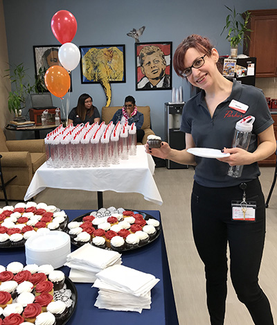
Parker branding anniversary celebrations took place at all campuses. Cupcakes with our lively brand colors and refreshments were served and all employees took home new Parker branded water bottle as a gift.
Parker’s President and CEO Roberto Muñiz addressed employees who were celebrating at Parker at Stonegate, “Whatever we do, the most important thing is the outcome for those we care for. We’re showing the world that our residents and members can be #WithIt at any age and breaking down the negative stereotypes of what people typically think of when they think of aging. One year since our brand relaunch, I’m still feeling the energy and joy of where we are going with our new look.”
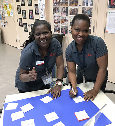
As part of our anniversary, Parker employees took part in an activity where everyone was asked to describe Parker’s company culture in one word. The answers will be combined in a new word cloud soon to be unveiled, yet the one word that employees used to describe Parker the most was CARING.
Posted on May 25, 2018